Google Finance's Legal Entity Creation
Close is not a moment. It’s an audit trail. When key fields can’t be traced to their source, trust collapses into second-guessing and workarounds.
I was the UX engineer on a cross-functional pod inside Google Finance building an internal workflow for legal entity creation (known internally as Introspect). I partnered with product design, a UX writer, and SWEs/data partners; my focus was turning a messy, multi-system process into shippable UI: resilient components, production interactions, and the instrumentation needed to prove it worked.
The original reality was ordinary and expensive: entities lived across systems with inconsistent labels, rollups that broke on edge cases, and shadow spreadsheets that tried to keep the story straight. The goal was not a prettier report. It was a system people could trust during close and during entity creation, with one canonical identity, clear ownership, and freshness you could verify.
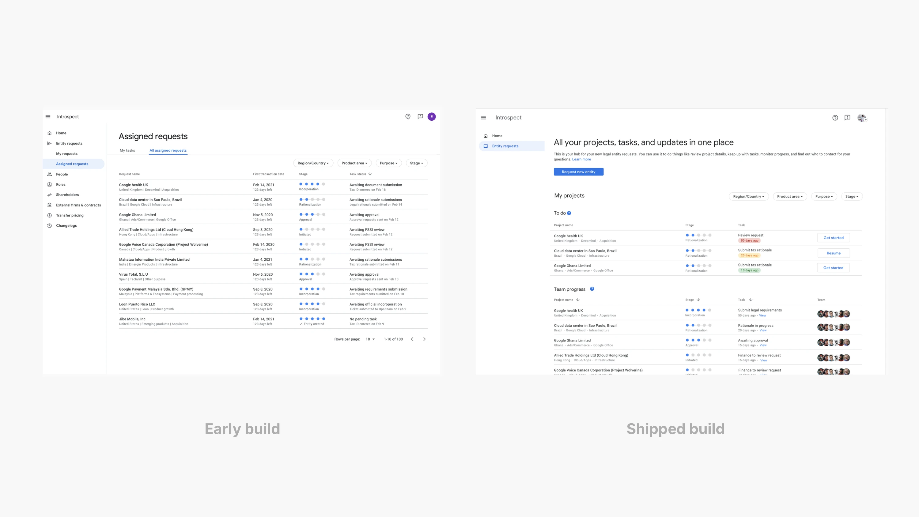
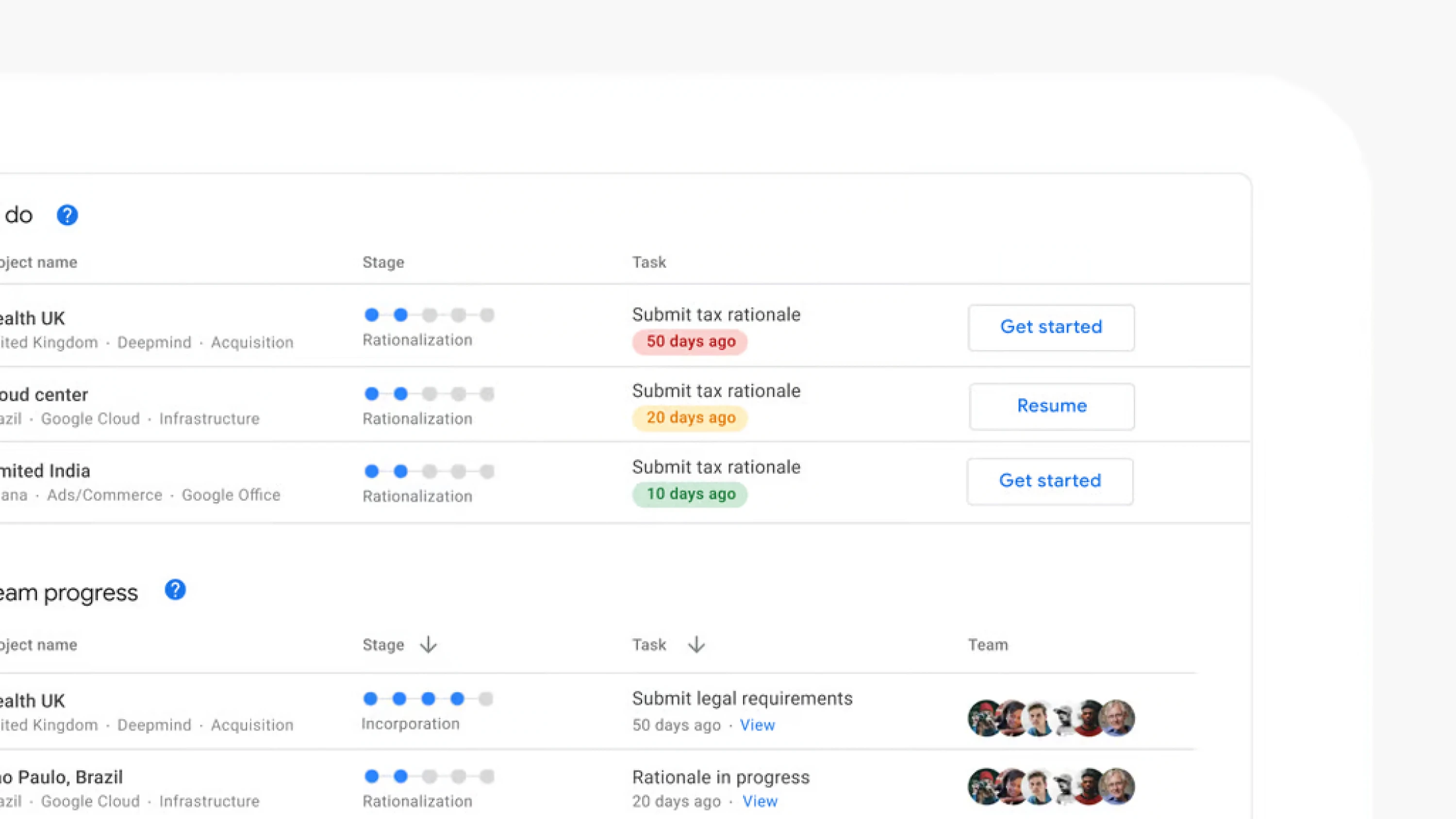
That meant the product had to behave like a workflow, not a warehouse. We gave people a home that answers the first question at a glance: what am I responsible for right now. “My projects” and “Team progress” made the work legible without forcing anyone to reconstruct it from email. Each row reads as a compact status sentence: stage, next task, age, and who is involved. If something is stalled, it looks stalled. If it is waiting on someone, it says so.
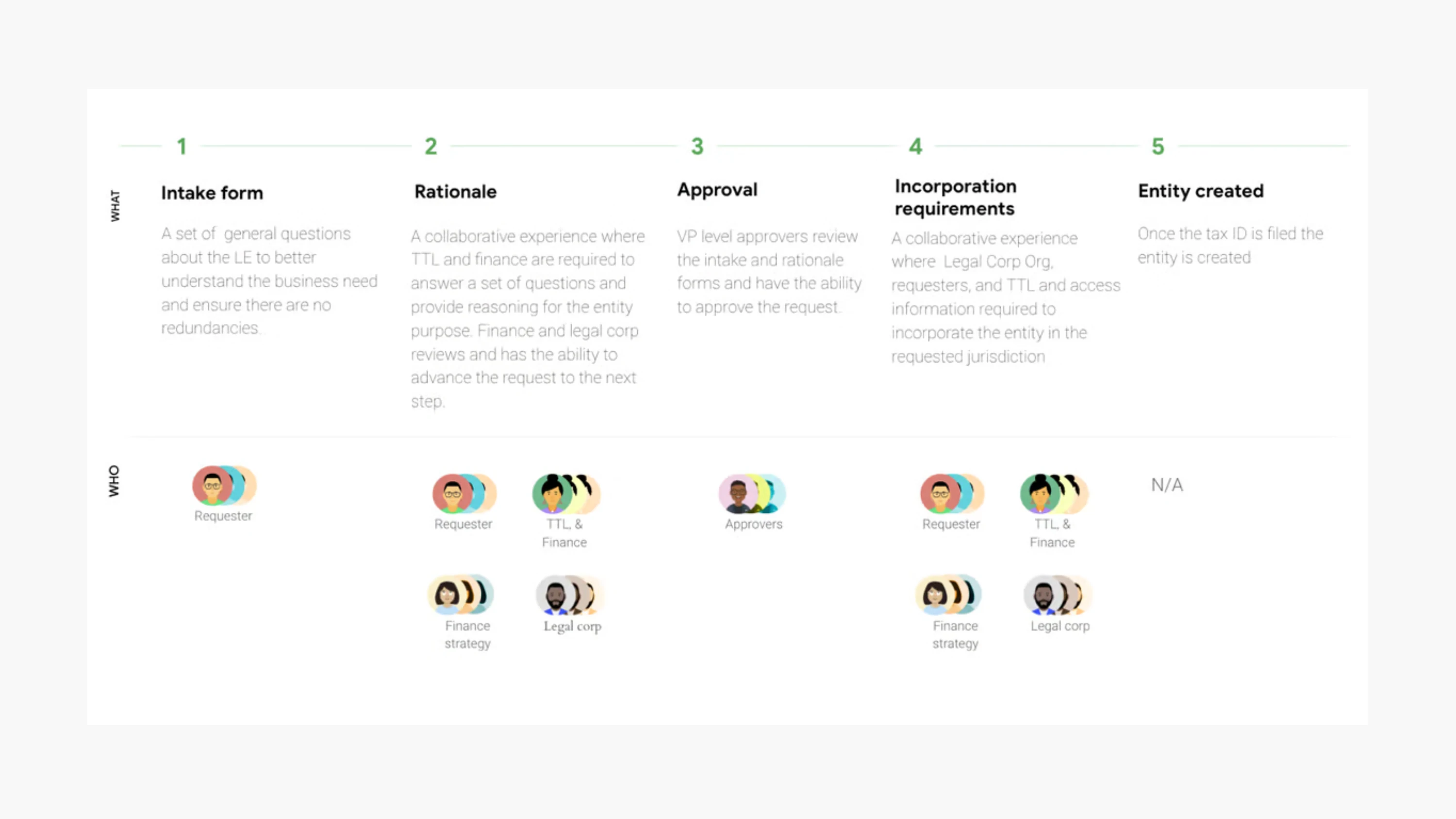
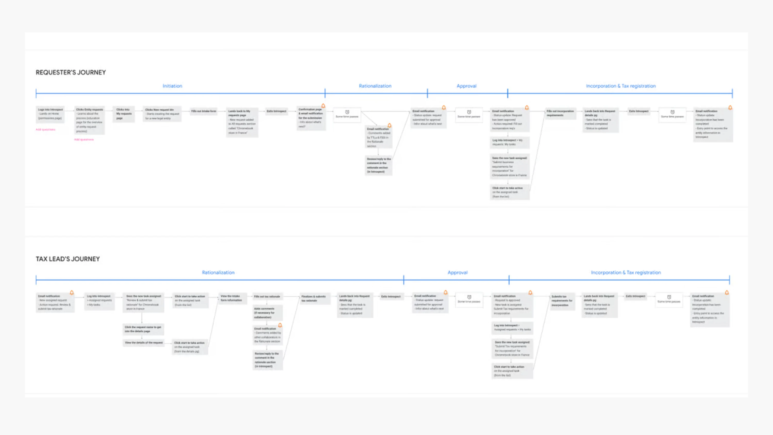
Creation needed the same discipline. The intake form had to gather enough to prevent bad entities, without turning every request into a bureaucratic endurance test. So we used a structured, stepwise flow that keeps context visible and makes requirements explicit as you move. Instead of dense pages of policy, we relied on progressive disclosure: the small piece of guidance that applies to the field you are in, written in language people can repeat to each other. Comments sit alongside the form, not buried in a separate thread, because reviews are social and the record of why matters almost as much as the record of what.
Underneath the UI, we treated identity as the anchor. Every entity resolves to a canonical ID, and the page tells you what it is, what it maps to, what is missing, and when it last refreshed. Freshness and completeness are not decorative metadata; they are the difference between confidence and second guessing at close. When a source is partial or a feed fails, the interface says which one, so uncertainty is visible rather than silent.


Once entities exist, reviewers still need to read numbers as evidence, not as assertion. So we kept movement narrow and reversible. Find an entity, choose a period, apply a small set of tested facets, and read a table you can explain out loud. Drill-downs open in place so context holds. Lineage opens at the side so you can trace a figure back to its origin without losing your spot, and return without starting over.
Variance needed an explanation that matched the way this system actually changes. We gave people a structured way to attach “why” to “what,” so common causes are easy to see and the unusual ones stand out: FX, mapping changes, one-time adjustments, timing, late arriving data. Notes can be pinned to the row so the next reviewer does not begin from zero, and so decisions made under pressure leave a readable trail.
Accessibility work was not treated as polish at the end. It shaped the surface early: predictable focus order, clear labels, and layouts that hold up when you navigate without a mouse. In practice, it made the product calmer for everyone, because the same discipline that helps assistive tech also helps tired humans during close.
We measured the basics with our data science partners: project creation started and completed, filter apply, drill-down open, lineage view, notes created, export, and how often people bounced to spreadsheets as a workaround. The practical signals were time to first answer and the rate of rework after review. The guardrails were freshness and completeness, because trust is hard to earn and easy to lose.
The result is quiet. Requests move forward with fewer handoffs. Reviews take less reconstruction. And when something looks wrong, you can trace it back to its source and leave a note that makes the next pass faster. In early user feedback, one incorporation went “from initiation to incorporation…16 days,” and the broader effort was recognized internally for UX quality. ♦
I was the UX engineer on a cross-functional pod inside Google Finance building an internal workflow for legal entity creation (known internally as Introspect). I partnered with product design, a UX writer, and SWEs/data partners; my focus was turning a messy, multi-system process into shippable UI: resilient components, production interactions, and the instrumentation needed to prove it worked.
The original reality was ordinary and expensive: entities lived across systems with inconsistent labels, rollups that broke on edge cases, and shadow spreadsheets that tried to keep the story straight. The goal was not a prettier report. It was a system people could trust during close and during entity creation, with one canonical identity, clear ownership, and freshness you could verify.
That meant the product had to behave like a workflow, not a warehouse. We gave people a home that answers the first question at a glance: what am I responsible for right now. “My projects” and “Team progress” made the work legible without forcing anyone to reconstruct it from email. Each row reads as a compact status sentence: stage, next task, age, and who is involved. If something is stalled, it looks stalled. If it is waiting on someone, it says so.
Creation needed the same discipline. The intake form had to gather enough to prevent bad entities, without turning every request into a bureaucratic endurance test. So we used a structured, stepwise flow that keeps context visible and makes requirements explicit as you move. Instead of dense pages of policy, we relied on progressive disclosure: the small piece of guidance that applies to the field you are in, written in language people can repeat to each other. Comments sit alongside the form, not buried in a separate thread, because reviews are social and the record of why matters almost as much as the record of what.
Underneath the UI, we treated identity as the anchor. Every entity resolves to a canonical ID, and the page tells you what it is, what it maps to, what is missing, and when it last refreshed. Freshness and completeness are not decorative metadata; they are the difference between confidence and second guessing at close. When a source is partial or a feed fails, the interface says which one, so uncertainty is visible rather than silent.
Once entities exist, reviewers still need to read numbers as evidence, not as assertion. So we kept movement narrow and reversible. Find an entity, choose a period, apply a small set of tested facets, and read a table you can explain out loud. Drill-downs open in place so context holds. Lineage opens at the side so you can trace a figure back to its origin without losing your spot, and return without starting over.
Variance needed an explanation that matched the way this system actually changes. We gave people a structured way to attach “why” to “what,” so common causes are easy to see and the unusual ones stand out: FX, mapping changes, one-time adjustments, timing, late arriving data. Notes can be pinned to the row so the next reviewer does not begin from zero, and so decisions made under pressure leave a readable trail.
Accessibility work was not treated as polish at the end. It shaped the surface early: predictable focus order, clear labels, and layouts that hold up when you navigate without a mouse. In practice, it made the product calmer for everyone, because the same discipline that helps assistive tech also helps tired humans during close.
We measured the basics with our data science partners: project creation started and completed, filter apply, drill-down open, lineage view, notes created, export, and how often people bounced to spreadsheets as a workaround. The practical signals were time to first answer and the rate of rework after review. The guardrails were freshness and completeness, because trust is hard to earn and easy to lose.
The result is quiet. Requests move forward with fewer handoffs. Reviews take less reconstruction. And when something looks wrong, you can trace it back to its source and leave a note that makes the next pass faster. In early user feedback, one incorporation went “from initiation to incorporation…16 days,” and the broader effort was recognized internally for UX quality. ♦