J.P. Morgan — 2026

For the past few months I’ve been quietly designing the tools J.P. Morgan's M&A teams use to evaluate companies, structure transactions, and run live deals.

Much of the work is making financial models easier to explore, so teams can see how a change in assumptions plays out across the valuation and structure of a deal.

A synthetic universe of 1,200 companies spans six sectors, three maturity levels and peripheral profiles across all four quadrants. It is not actual company data or a measured sector distribution. The opening reveals individual observations in place. A declared cohort of 720 companies with established, comparable operating histories is highlighted; other profiles remain visible as quiet context. No company moves toward a regression line or acquires invented measurements. A single density scene summarizes that cohort with count bins and smoothed concentration. Three nearest-center groups use standardized feature distance within the cohort; colors describe computed peers, not sectors. Animated centers interpolate Lloyd states and membership follows the displayed centers. One pooled ordinary least-squares relationship separates into three descriptive within-peer fits on the declared cohort. Comparable outliers remain in these fits. Only endpoints are solved regressions; grouping uses those same features, so no inferential confidence bands are shown. Feature thresholds, chosen peer membership, tighter thresholds and an absolute residual tolerance of 0.065 are separate chosen screens. Counts are computed on the cohort and narrow 395 → 229 → 128 → 83. The residual tolerance is neither statistical uncertainty nor investment quality. The final screen opens back into the same universe. Click or press Enter to advance; focus pauses cycling. Reduced motion permits still manual stepping.
Current view: Full universe: 1,200 synthetic companies across sectors, maturities and peripheral profiles.

McKinsey & Company — 2022–2024


Prior, as a principal designer at McKinsey, I led the redesign of the core tools for our pricing and financial models, working across the firm to create a modern, unified design language that placed emphasis on forecasting and reporting scenarios.

This work touched every aspect of our practice’s engagements, from basic inputs and guardrails to playbooks, dashboards, and workflow logic.

Blue bubbles of different sizes illustrate pricing scenarios across a chart.
An anonymous synthetic promotion study, not client results. There are no visible commercial labels, identities or literal prices. The opening model is ordinary least squares on log price and log units from non-promotional observations. A selected promotion is compared with its fitted no-promotion baseline; this descriptive example does not establish causality. It then moves into an incremental sales and contribution-margin portfolio after the old observations clear. The horizontal dimension is margin lift, the vertical dimension is sales lift. Four softly shaded quadrants divide positive and negative outcomes at zero. Border rugs show marginal distributions, and the four footer bars summarize actual quadrant counts; an empty quadrant is not artificially populated. Sales lift equals actual revenue minus baseline revenue. Margin lift equals actual contribution margin minus baseline contribution margin. Five positive-sales, negative-margin events are selected for review. Reinvestment assumes cancelling those events restores baseline contribution margin, allocates that hypothetical recovery in a 3:2:1 ratio, and assumes marginal sales of 2.1 and contribution margin of 0.6 per dollar allocated. Hollow linked markers are projected outcomes; observed positions remain fixed. Transfer dots represent scenario budget. Click or press Enter to advance; focus pauses the loop. Reduced motion permits still stepping.
Current view: Non-promotion demand: log price and log units, with an ordinary least-squares fit.

Google Finance — 2018–2021

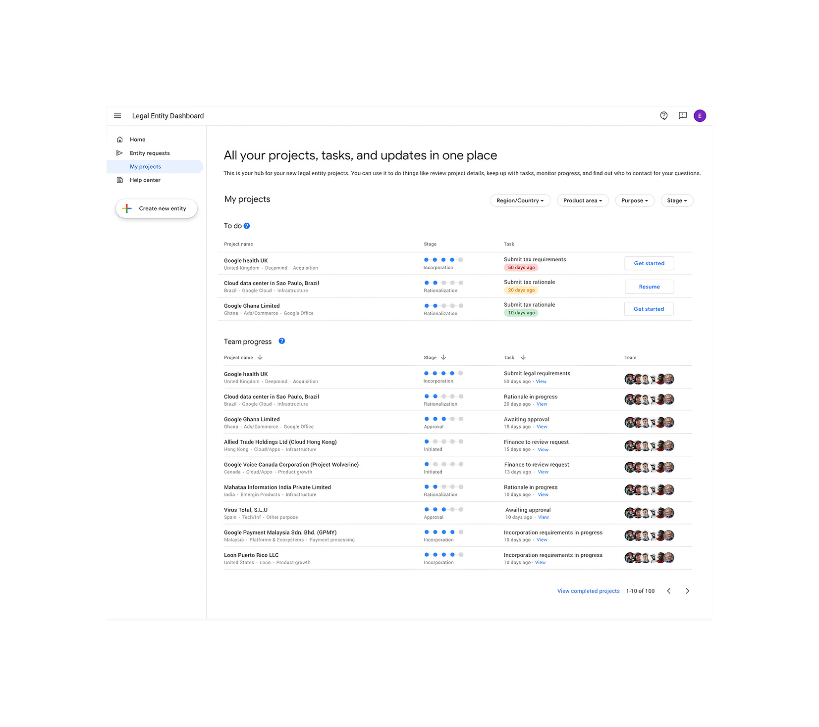
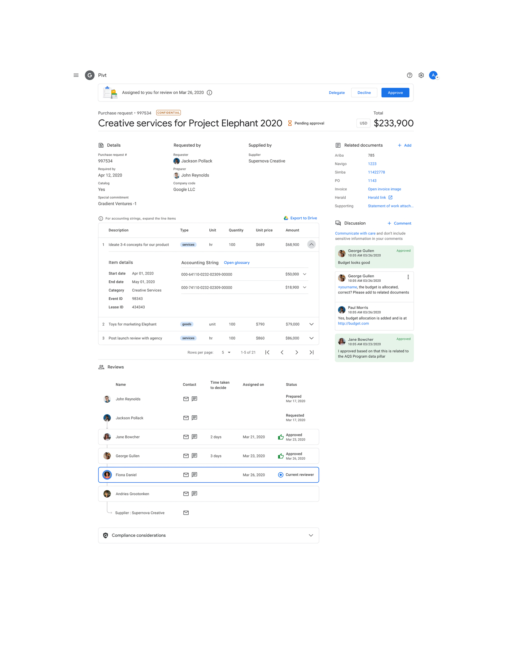
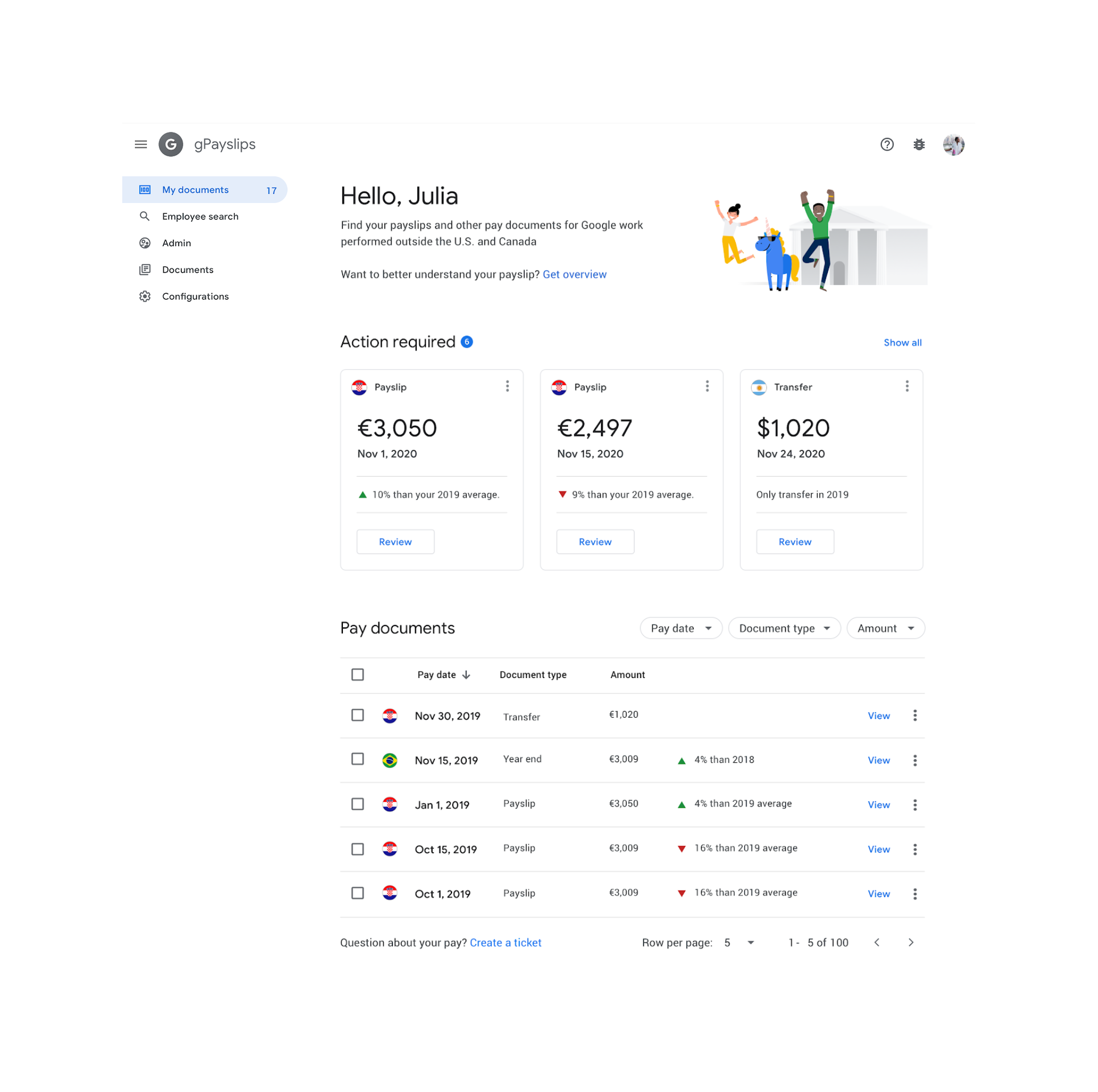
At Google, I joined the finance team as its founding design engineer and built a suite of innovative solutions to Alphabet's complex problems in forecasting, accounting, procurement, and compliance.

I extended a common design language across these new products, and stitched them into an end-to-end workflow whose whole trail is auditable.

Google Finance legal entity dashboard
Google Finance purchase request and approval interface
Google Finance payslips UI

Meta Developers’ App Dashboard — 2017

One of my more interesting projects was redesigning our developer community's experience with Meta's SDKs for iOS, Android, and Unity, turning data points and signals around app events like "add to cart," "purchase," or "level achieved," into views they could use to understand their users’ behavior.

I baked a lot of details into the core system design to make configuration simple and created clear navigation, consistent status models, and errors that explain themselves across dashboards and configuration surfaces.
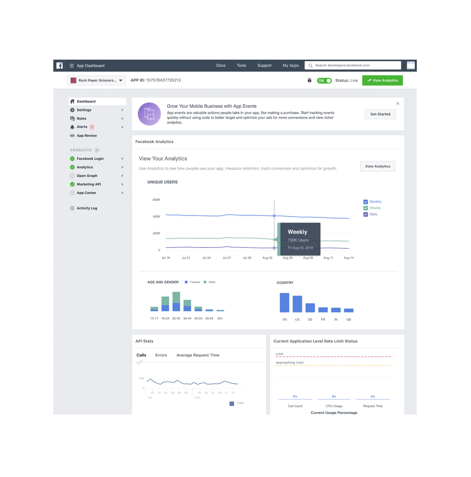
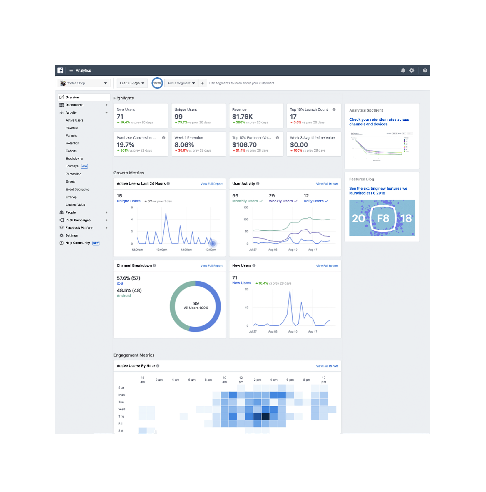
Meta app dashboard showing app-event analytics
Meta Analytics dashboard showing audience and engagement metrics

Speech Recognition and Synthesis API — 2017

At Google, I often built demos to explore small features or ideas I'm excited about, using them as a way to spark curiosity and to get my colleagues excited about new possibilities.

One example was a small concept for speech recognition and synthesis, where I explored how designers might better prototype various voice states. It covers the full loop from device permissions for listening to live transcription and spoken output, and has timeouts, retries, and support for multiple languages.

Nest × Yale Lock — 2016–2017

Over the years at Nest, I focused on the harmony between hardware, software, and the physical space of a home.

As a designer, I embedded with our data team for home automation partnerships like the Nest × Yale Lock, integrating it with the Nest ecosystem, and building features like unique passcodes for guests, tamper alerts, and compatibility with devices.

Google Assistant Actions on Nest — 2016–2017

With our data team, I used connectivity protocols and predictive patterns to suggest 'Routines', and added mesh networking visuals to show why a certain device wasn't connecting.

I later moved beyond screens and used speech, where I wrote the scripts and logic for critical moments in our status model that connected to Assistant's schema.

PhotoKit prototypes — 2016

Even before joining Google, I was fascinated with prototyping in Xcode. At one point, I built a PhotoKit iOS app to learn non-destructive photo editing.

This included the core adjustment loop: crop, rotation, tone, and color. Later, I used Codex to rebuild it in SwiftUI for iOS 26.

Contact

Since you've made it this far, I'd love to hear from you.